Saturday, October 27, 2012

My First Day with Microsoft Surface

A few months ago  I saw the unveiling of Microsoft Surface. My first though was: I want it! My second was: Microsoft has finally a compelling vision for the future. On October 16 I received an email, announcing that the tablet was available for preorder. I rushed to the ordering site, mildly disappointed by the options: the 64G model, with a boring black cover, or the 32G model, with a separate colored cover. I really wanted the 64G model, but I couldn't bear myself to get a boring black cover. Dear Microsoft, why didn't you let me order the more expensive model with a cover of my choice? Who was the marketing genius to propose this product strategy? I got over my frustration, and I placed an order for a 32G model, with a bright blue touch cover. I spent the following 10 days refreshing the ordering page, hoping to see "Order in Process..." becoming "Order Completed".

Yesterday I finally got my new Surface RT tablet. The tablet comes in a long slide-in box, along with the power cable, and a small booklet, which I didn't bother to open. In a separate box, I got my bright blue touch cover, which snaps to the Surface, making a satisfying clicking sound. The tablet is slightly heavier than expected. The material and the shape feels ok, respect to my iPad 3. The screen is better than I expected. Bright and crisp. The tablet feels solid, and the angle of the kick-stand is just right.
I brought the tablet to work, showing it off during few meetings. The setup, in my corporate network, was relatively effortless and, by 3PM, I could finally give some dedicated attention to my new toy.
At home, I showed it to my husband, David, which was very impressed by the device, and by Windows 8 new interface. I had used this device for approximately 8 hours, and I like it more than expected. The new Metro UI is just gorgeous. I love the clean, yet vibrant design. I also love many of the gestures and, just after few hours of continuous usage, I found myself trying them on my iPad. I like swiping from the right edge, to get access to the charms and to the global search. I like swiping from the left edge, to get access to all my open windows. I LOVE being able to close the current app by swiping top to bottom. During my iPad daily usage, I open many different apps, which consume memory and/or power. I find that closing these many apps is a very tedious task.
The picture password is just brilliant. I selected my favorite picture and recorded gestures on part of the image that have significance for me. That is just beautiful. My 6 years old, was very excited realizing he could learn to login without help.
Uploading and downloading pictures to my Picasa site was almost unexpected on a tablet. I got so used to the frustration of not having access to the file system, that being able to manage my files felt almost like cheating.
Being able to use MS Office was also a great plus. I was able to write this blog entry using Word.
Finally, did I mention that the keyboard has left-right navigation arrows? Placing your cursor in a precise text location is often a challenge on the iPad.
A few months ago I was given an Android tablet, and I found the experience so frustrating that I sold the device after a couple of weeks. I was unsure how this new device would compare to my beloved iPad. I am pleased to announce that not only does it compares well but it enables a wide range of tasks more comfortably and efficiently. When I first played with Windows 8 a few months ago, I was very puzzled about the coexistence of Metro and Desktop mode. I now believe that the secret for success stands in the careful partition of functionality across the two modes.
Metro is simple and beautiful. Applications are interactive, intuitive, extremely visual, and they manage data and files for you. No need to understand the file system. But, if you do understand the file system, all the power that comes with it, switch to the Desktop mode when you need and everything is still there for you.
Desktop mode looks and works better with large screens, keyboards and mouse.
Metro mode looks and works best on tablets.
Since these two modes are fairly different, switching among them is a bit jarring. It is important to keep the user in the same environment while performing his daily activity. Microsoft partitioned applications in work (Desktop), and entertainment (Metro).  In case where the line got blurry, as for Explorer and OneNote, they wisely duplicated application in both modes.
This partition is right on and this is the way I expect I will be using Microsoft Surface and Windows 8 in general.
I will use my desktop PC when sitting at my desk and performing complex tasks, mostly in desktop mode. When attending meetings in the office and playing at home, I will use my tablet, in Metro mode most of the time.
Although I am very satisfied with my experience, the surface does look a bit like a v1 product, although an excellent v1. The lack of 3G/4G/LTE connection is probably the biggest shortcoming which will push me back to my beloved iPad when travelling.

Saturday, July 21, 2012

Follow Along Tutorials

Adobe is experimenting with follow along tutorials making them integral part of the interface both on desktop and table applications. In Photoshop for iPad the landing page features a set of tutorials introducing to the main features of the application.


I don't like reading help or documentation, and my style of learning, as the large majority of people, is more example based. Follow along tutorials are a very effective way to learn even the most complex tools.
When a tutorial first introduces a feature it often point to its location in the interface.


On the iPad the screen is pretty limited, and Adobe was able to fit the entire UI required for the follow along tutorial in one narrow bar on the bottom. Relevant, but not essential information is displaying it in form or tips in the context of the specific step.


The bar on the bottom displays the current step, enable to jump to adjacent steps and provides the access to related tips.


Adobe adopts a similar strategy in one of its newest product: Edge. Edge is a tool for creating interactive motion content for the web using HTML5, CSS3, and JavaScript. The start-up page features the main tutorials.


After selecting  a tutorial a Lessons panels appears on the right and it displays the follow along steps.


After completing a tutorial the panel displays the list of all tutorial, enabling the user to select the next one.


Follow along tutorial is a very powerful and effective tool for many different types of applications.
This approach can be applied to the more diverse problems. Below and example of this strategy applied to teaching a coding language.

Friday, July 13, 2012

Google Now on Jellybean

What if a your phone could know where you are, what your interests are, when you have your next appointment, what time of the day is, and give you the right information just when you need it? This is what the new Google Now does.

Let's assume you are commuting from or to home. Google Now tells you how long your usual commute is going to be and if there is a faster route.


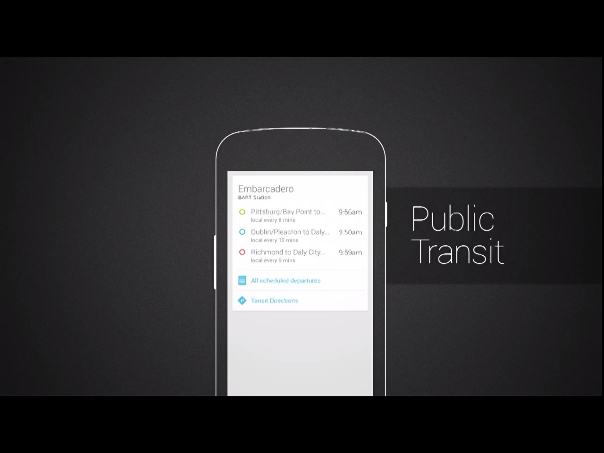
When you are close to a bus stop or a subway station Google Now tells you when the new vehicle will arrive.


Google Now tells you about bar and restaurants around you when you walk down the street. When you are in a restaurant trying to order, Google Now tells you what that restaurants is most known for.


When you have a calendar appointment Google now will tell you how to get there on time. For example, if you usually take the bus to get around, Google Now will tell you when to leave, based on how long will take you to walk to the bus stop, when the next bus will arrive, and how long that bus ride will take to get there on time.


If you have an upcoming flight that you searched for Google Now keeps you up to date on the current status, which terminal to go to and updates you if there is a delay.


Google Now keeps you updated on your favorite sport team in real time. There is no need of customization. Google Now knows about your favorite team based on the search you had done.


Google Now knows when you are traveling. When you travel internationally Google Now gives you a card for currency convention, translation, and it even tell you what time is back home.


How it works

The way to access Google Now is by swiping from the home screen.


Google now display a home screen with all the cards that apply to your specific situation. In the image below the first card list an upcoming meeting, and tell me how long is going to take me to get there.


A notification will warn me when is time to leave, based on how long is going to take me to get there.


Google Now knows if I are a Giant's fan, and tell Me that there is a game in a few hours, and I can buy tickets from here.


Google now knows that I am not here too often, and that I don't know the area too well. Google now shows few interesting places nearby, including some restaurants.


If a tap on a specific restaurant, this takes me to google maps, and from here I can get various information, and even book a table if I want to.


Google Now knows that I have a flight scheduled, and that it is delayed, so I have time for my usual workout to the gyn if I want to.


Thursday, July 12, 2012

Jellybean new search UI

Jellybean introduced Search Cars as the new UI for displaying featured search results. Search Cards provide a visual and easy-to-scan display of the results, accompanying textual information with images and link to the source.
Following some examples. A search of Angelina Jolie's movies would return a picture of the actress alongside with a list of her most popular movies and a link to Wikipedia.
A search of the earth's mass would return an image of our planet with the mass value in kilos and a link to Wikipedia.
In a way Google was already experimenting with a similar approach in their new search "what do you love"

But this is not all. Searching is getting smarter using your current location to provide results that better fit your needs. Searching for the weather forecast displays information about your current location and five days forecast. Searching for Starbucks displays Starbucks location around you.

Searching for pictures of a specific subject returns a set of images organized in a grid.

Swiping away the search card would reveal more results.

In place of the cards Jellybean will then display a more traditional scrolling list of all results.


Friday, July 6, 2012

Metro Style UI on the iPad

I am very intrigued by the new Metro design introduced by Microsoft, and I was excited to experience it on the iPad.
Track 8 is a gorgeous Metro music app with nice graphics, a clean layout, and smooth animations between menus.

Track 8 displays songs by artists, albums and playlist, and it shows best if your songs all have album artwork.

Less impressive, but still interesting, is FlickStack: a photo browsing app for Flickr and 500px photos.
The style adopted by FlickStack is a mixture between iPad and Metro style. Below an image of the home screen.

When in portrait orientation the left navigation is collapsed and the picture tabloid takes the full screen

The images of a selected stream are displayed in a even grid, which I found visually less interesting.


The same view in landscape orientation displays the navigation to all streams, compacted in a panel on the left, and the images of the screen on the right. I found this layout a little too busy and unnecessarily complex.

If you are not on a budget, you can experience, for  $25, a more complete Metro experience on your iPad by using Win8 Metro Testbed – powered by Splashtop. Win8 Metro Testbed is a simple remote desktop application, and it requires a connection to a PC installed with Windows 8 Consumer Preview.

Friday, June 29, 2012

Parallel Browsing Across Categories

Amazon Windowshop has an interesting solution for allowing browsing products within a specific category and across related categories. Categories are listed on the top of the main screen, and products are listed below each category. Vertical scrolling is more convenient than horizontal scrolling and this arrangement makes it easy to browse products from multiple categories at once. Amazon cleverly arranges related categories next to each other, for a more effective parallel browsing experience.

Tapping on any of the top level category drills down to subcategories. The example below display the subcategory for Electronics.

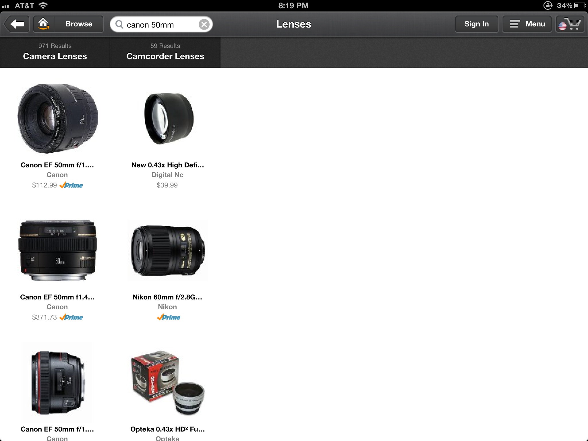
When searching for an item, all categories that contains search result will display and user may drill within the filter categories.

The example below show the results for the search term "canon 50mm", after drilling to the Lens subcategory.

Tapping on any of the product reveals its details. When in this view user can easily browse details for all products in that category, by tapping on the arrow navigation on the bottom.

Amazon navigation is very clever and fun to use, enabling parallel browsing within multiple categories. You can view this short movie where I capture the interaction with this app.

Tuesday, June 26, 2012

Faceted Search Sliders

While looking for interesting designs I stumbled upon whichbook.net, which has an interesting solution for displaying search facets. Whichbook.net represents each facet in terms of its extreme values. I found this approach to be very clever, simple and intuitive. Try to apply a more traditional label-per-slider approach to this screen. Maybe you can do better than me, but I could only get to a more complex and confusing list.

Can you do better? Guess what: I ended up buying a book! :)

Monday, June 25, 2012

Thumb Reach Area on Smartphones

Luke Wroblewski in his seminar, Designing Mobile Web Experiences, speaks about the area of easy reach in mobile devices. Luke claims that smartphones have preferred reach zones when operated in portrait and landscape orientation. Devices used in portrait orientation are usually operated with one hand, and the preferred reach zone is located in the lower center of the screen.


Devices used in landscape orientation are usually operated with two hands, and the reach zone is significantly different.


While listening to Luke's explanation I realized I have always seen this, but somehow my brain never registered the observation.
Few popular iPhone apps, took this lesson to heart and opted for a custom tab navigation bar, placing the main action in the lower center of the screen. This is, in fact, a convenient location for both left and right handed individuals that operate their smartphone in landscape orientation.


The article below is a collection of different visual designs for tab navigation, most of which seems to emphasize the central tab with a larger size and distinctive style
Examples of iPhone iOS UITabBar Interfaces

Tuesday, June 19, 2012

Dealing with Hidden Gestures

Our beloved mobile devices rely on a new type of input: multi-touch gesture. This is a relatively new domain, and while some gestures, as pinch to zoom, are becoming a standard interaction, there are many others used sporadically and inconsistently among apps.
Multi-touch gesture is a powerful new way to express input, but how can an app overcome the discoverability challenges?
In this article I am listing few solutions I have run into and few thoughts about their pro and cons.
Help window.
Some app, as ArtRage, display all available gestures in a separate window or pop-up invoked from a traditional help button.
The advantage is that I can get help when I need it.
The disadvantage is that I may never open the help to discover that multiple gestures are available.


Overview during startup
Some apps, as RDP or Spashtop Remote, display a help screen at the startup which illustrates all main gestures used in the app.
The advantage is that I have to view this information at least once.
The disadvantage is that this information shows when I less need it. The pop-up is kind of annoying, but I am afraid to permanently closing it, for when I need it in the future. I keep dealing with it, yet being mildly annoyed. More important, I am not sure how to get this information while using the app, which is when I actually need it.


Help when you need it
Another strategy, used by Google app, is to display a help tip the first time I am in a context where the tip applies.
The advantage is that this information shows when I most likely need it.
The disadvantage is that I may forget the gesture in the future, and have no way to bring back these instructions.


Overlay at startup and on demand
Finally some app, as Sanpseed, display help information both at the first launch of the app and on demand.
The advantage is that the information is both discoverable for the first time user and easy to retrieve when you need it. This solution provides a place to display both help on the gestures and on other areas of the user interface.
I can't see any obvious disadvantage, except that you may need to remember to get help.


- Posted using BlogPress from my iPad

Sunday, June 3, 2012

Pan, Zoom and Transform in SketchBook Express

I was playing with SketchBook Express on my MAC today, and I found the transformation and pan/zoom widgets intriguing.

Transformation Widget
SketchBook Express implements a novel solution for transforming a selected area. Upon selection a widget enables a different type of transformations: move, rotate and scale. The default action is pan, so, If I select, and start dragging right after, the widget will perform a move.

The widget appears when moving the mouse near the selection and it disappears when moving away from it. This is a similar show/hide behavior that Word implements for contextual floating toolbars. I found somewhat annoying Word's permanently hiding the toolbar when I move the mouse too far. Clearly Word tries to guess my intentions, but, as usual, smart behaviors are great if they right 90%, and frustrating otherwise. Luckily SketchBook does not fall into this trap, and it provides a simple close button to explicitly hide of the widget.


While this widget provides an interesting solution for transforming a selection, it does take some time to get used to it. I found myself always hesitating a bit before starting a move. Will I ever adapt?

Pan/Zoom Widget
SketchBook Express implements also a novel solution for Pan and Zoom. Upon press and hold of the SPACE bar the app displays a floating Pan/Zoom widget.

I can manipulate the view until I get when I want, then release the SPACE bar to return to my previous mode. Pan/Zoom is also an explicit mode, but I found the quasi-modal solution the most appealing.


SketchBook Express is free on the MAC. if you find intriguing what I described, try it for yourself!

Twitter Facebook Google Plus Stumbleupon RSS Feed

 
Design by Free WordPress Themes | Bloggerized by Lasantha - Premium Blogger Themes | Best Web Hosting Coupons