5:38 AM

I was playing with SketchBook Express on my MAC today, and I found the transformation and pan/zoom widgets intriguing.
Transformation Widget
SketchBook Express implements a novel solution for transforming a selected area. Upon selection a widget enables a different type of transformations: move, rotate and scale. The default action is pan, so, If I select, and start dragging right after, the widget will perform a move.


The widget appears when moving the mouse near the selection and it disappears when moving away from it. This is a similar show/hide behavior that Word implements for contextual floating toolbars. I found somewhat annoying Word's permanently hiding the toolbar when I move the mouse too far. Clearly Word tries to guess my intentions, but, as usual, smart behaviors are great if they right 90%, and frustrating otherwise. Luckily SketchBook does not fall into this trap, and it provides a simple close button to explicitly hide of the widget.
While this widget provides an interesting solution for transforming a selection, it does take some time to get used to it. I found myself always hesitating a bit before starting a move. Will I ever adapt?
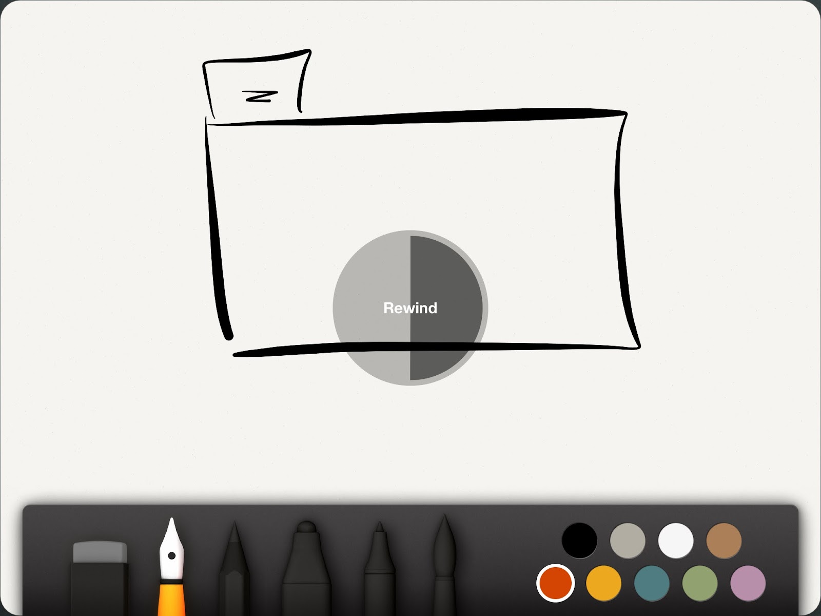
Pan/Zoom Widget
SketchBook Express implements also a novel solution for Pan and Zoom. Upon press and hold of the SPACE bar the app displays a floating Pan/Zoom widget.


I can manipulate the view until I get when I want, then release the SPACE bar to return to my previous mode. Pan/Zoom is also an explicit mode, but I found the quasi-modal solution the most appealing.
SketchBook Express is free on the MAC. if you find intriguing what I described, try it for yourself!
Transformation Widget
SketchBook Express implements a novel solution for transforming a selected area. Upon selection a widget enables a different type of transformations: move, rotate and scale. The default action is pan, so, If I select, and start dragging right after, the widget will perform a move.
The widget appears when moving the mouse near the selection and it disappears when moving away from it. This is a similar show/hide behavior that Word implements for contextual floating toolbars. I found somewhat annoying Word's permanently hiding the toolbar when I move the mouse too far. Clearly Word tries to guess my intentions, but, as usual, smart behaviors are great if they right 90%, and frustrating otherwise. Luckily SketchBook does not fall into this trap, and it provides a simple close button to explicitly hide of the widget.
While this widget provides an interesting solution for transforming a selection, it does take some time to get used to it. I found myself always hesitating a bit before starting a move. Will I ever adapt?
Pan/Zoom Widget
SketchBook Express implements also a novel solution for Pan and Zoom. Upon press and hold of the SPACE bar the app displays a floating Pan/Zoom widget.
I can manipulate the view until I get when I want, then release the SPACE bar to return to my previous mode. Pan/Zoom is also an explicit mode, but I found the quasi-modal solution the most appealing.
SketchBook Express is free on the MAC. if you find intriguing what I described, try it for yourself!